From Platform to Pipeline:
Redesigning Flybuy.com for Growth
Snapshot
Project: Full redesign of Flybuy.com, the company’s marketing website
Role: Lead designer and developer
Platforms: Figma, WordPress, Google Analytics
Key Outcomes
+35% year-over-year increase in website traffic
+10% year-over-year increase in inbound sales leads
13.5% conversion rate from lead to closed deal
The Problem & Opportunity
Flybuy by Radius Networks is a leading AI location platform empowering businesses to deliver seamless customer experiences. During this redesign, the company was undergoing a broader brand evolution while simultaneously launching new products that expanded its value proposition.
The existing website struggled to clearly communicate what Flybuy did, who it was for, and why it mattered, especially to different buyer personas evaluating the platform from marketing, product, and operations perspectives. This created friction in early sales conversations and limited the site’s effectiveness as a growth channel.
The opportunity was to transform Flybuy.com into a clear, conversion-focused marketing asset that could communicate complex technology simply, support multiple buyer journeys, and directly contribute to pipeline growth.
What Success Looked Like
A clearer, more modern experience that communicated Flybuy’s value at a glance
Increased inbound demand and higher-quality leads for the sales team
Improved SEO performance to support long-term, organic growth
Strategy & Approach
Grounded the redesign in market context, conducting comparative and competitive analysis to clarify Flybuy’s differentiation and positioning within the location intelligence space
Aligned visual design with the evolving brand, refreshing the site’s look and feel to reflect updated brand guidelines while maintaining clarity and readability
Optimized for conversion, running A/B tests on inbound form patterns to identify approaches that improved lead quality and conversion from lead to closed deal
Design Highlights
Insight → Decision → Outcome
Insight
By synthesizing data and testimonials from our research team, product team, and customers, I identified a key differentiator of the Flybuy platform: its clear return on investment. Improving the customer experience directly translates into measurable revenue impact for brands.
Decision
To effectively communicate this value on the website, I explored ways to make the ROI more tangible for prospective customers. I implemented a revenue impact calculator that allows users to input details about their business (such as size and average order value) and receive an estimate of the additional revenue they could generate by implementing Flybuy.
Outcome
The calculator became both a high-value website feature and a sales enablement tool used in outbound outreach to prospective clients. Increased traffic to the site contributed to a 10% year-over-year increase in inbound sales leads.
Insight
In conversations with our sales team about common blockers in selling the platform, a recurring question surfaced: “How do we explain what we do in one line?” This highlighted a gap in the marketing website. I realized it needed to clearly communicate, at a glance, what Flybuy offers and how it helps businesses.
Decision
For the homepage hero, I moved away from complex technical graphics and stock photography and instead aligned with the new brand voice. I designed a simple background paired with a strong, outcome-driven headline: “Faster Service. Higher Sales.” supported by the subheader, “Transform your business with our AI-powered location platform.”
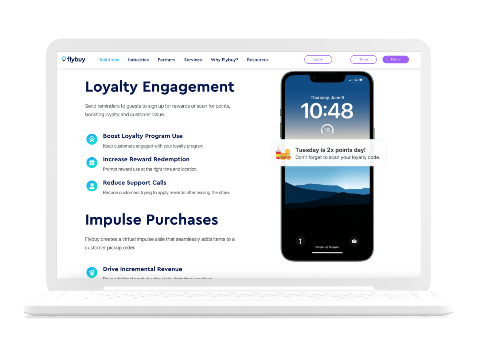
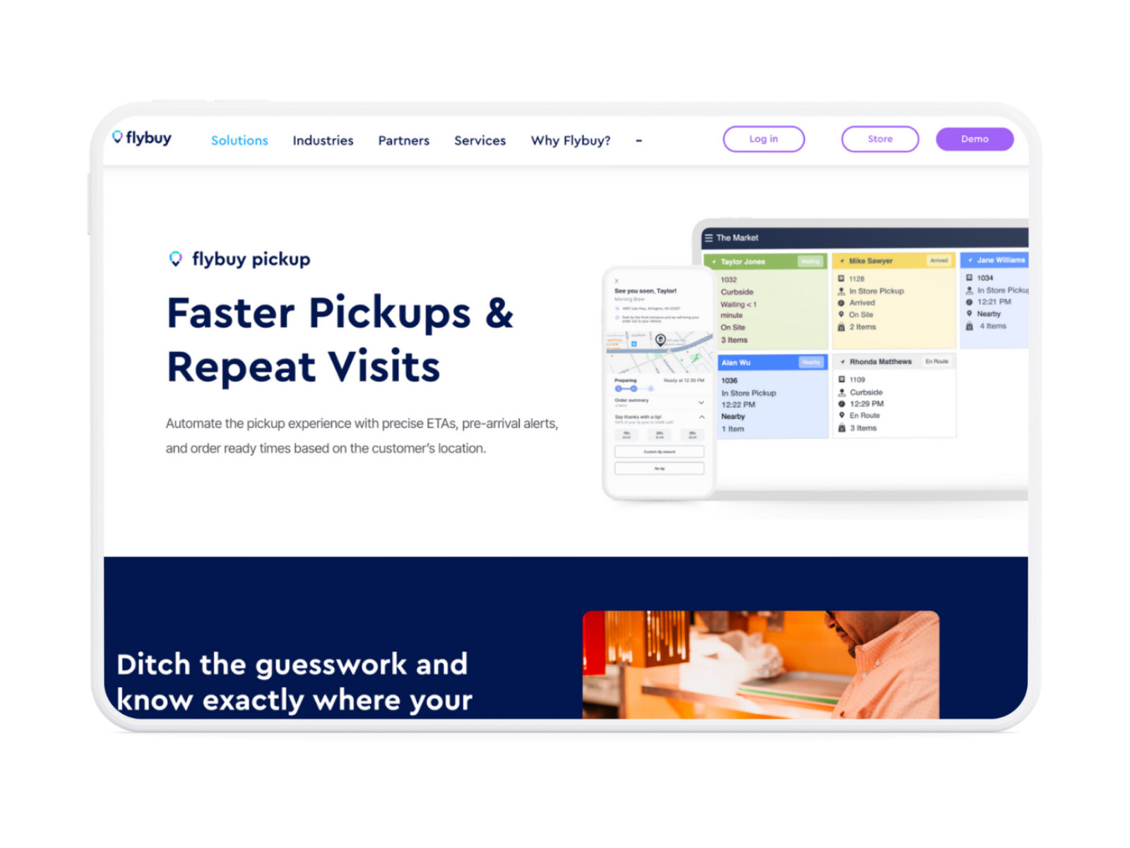
To further improve clarity and discovery, I structured the main navigation so visitors could explore solutions either by industry (restaurant, grocery, pharmacy, etc.) or by product need (pickup, delivery optimization, loyalty engagement, etc.).
Outcome
The redesigned homepage clarified Flybuy’s value proposition at a glance, giving sales teams a concise, repeatable way to explain what the platform does and why it matters. By leading with a clear, outcome-driven message and simplifying navigation around industries and product needs, the site made it easier for prospects to quickly self-identify how Flybuy could support their business. This reduced friction in early sales conversations, improved alignment between marketing and sales, and positioned the website as a more effective top-of-funnel asset rather than a purely informational one.
Impact
Redesigning the look and feel of the website as well as streamlining navigation has led to a 35% YoY increase in traffic. Internal stakeholders also have increased confidence pointing prospects and interested partners to the marketing website for a quick 360 glance at our platform. Testing different lead form styles and landing on a simple email-only approach has led to a 10% YoY increase in inbound sales leads and a 13.5% conversion rate from lead to closed deal.
Reflection
Aligning internally on this redesign required navigating a high level of ambiguity. Across marketing, product, and leadership, we iterated through multiple versions of our brand identity, tagline, and differentiators before landing on a shared narrative. The challenge wasn’t just visual consistency, it was distilling a highly technical platform into a clear, compelling story that could resonate with multiple buyer types, from marketing executives to product and operations leaders.
This process reinforced the importance of design as a translation layer between technical complexity and business value. By facilitating alignment and grounding decisions in clarity and usability, the final site was able to communicate Flybuy’s value more effectively while supporting both marketing and sales goals.